
JAY TARRANT
VISUAL DEVELOPMENT | CONCEPT ARTIST
UNIT 10 -
Personal Research Projects

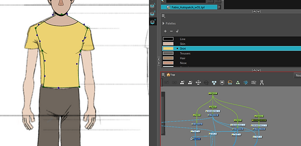
My series of projects was inspired by Trainspotting. Throughout this project, my ideas and goals changed a lot. Focusing specifically on 'The Worst Toilet in Scotland' scene, I set out to reimagine this scene as an animation. I planned to learn new skills and programs using the knowledge I have already learnt, transferring these skills or learning from online sources.
Outline of Skills and Software
Project 1 - Learning Maya
Using my knowledge from 3D Modelling in Blender, I plan to transfer these skills to Maya. My main focus, outside of the program transfer, is to focus on UV unwrapping and texturing. Since learning Blender, I have relied heavily on the 'Smart UV Unwrap' tool, and I have never really put time or effort into successfully UV unwrapping objects myself. My goal for this portion of the project is to successfully UV Unwrap all elements of the environment without intervention from Maya. I also plan to learn more about correct lighting in environments and characters. With previous projects, I have focused mainly on dramatic lighting but not thought further about depth or composition when lighting a scene. Many of my scenes have been very darkly lit in the final renders, with simple one-point lighting or relying heavily on physical lighting. Throughout this section, I aim to learn more about three-point lighting regarding environments and characters.
Project 2 - 2D Character Rigging in ToonBoom Harmony
The second project has changed multiple times over the duration of this unit. I will review previous efforts later. I finally decided to learn more about 2D character animation using ToonBoom. My primary goal for this project is to learn how to create a 2D Rigged character. Utilising character sheets and expression sheets, I hope to create a full range of motion within this character.
.
.
Project 3 - Colour Grading and Compositing in Nuke
For this section, my goal is to learn more about node-based compositing.
.
.
The Inspiration
This is the scene I planned to use to inspire my outcomes. It is already incredibly unique, and I thought animation would give me a lot of opportunities to accentuate this and add some really interesting details.
Project 1 - Maya
As this portion of the project was directly inspired by the bathroom seen in Trainspotting, I was unsure how to create the concept art. I knew I didn't want to copy the bathroom exactly, but it would be heavily inspired. Initially, I wanted to model and texture a bathroom inspired by painterly styles. I looked into concept art from stylised TV shows such as Arcane, EnterGalactica and SpiderVerse. An issue I've constantly encountered is that my concept art tends to develop into quite illustrative drawings rather than concepts. I thought looking into more painterly styles would help me break this habit, forcing me to keep drawing loose.


Concept Art from Arcane (TV Show)


Concept Art from EnterGalactica (TV Show)


Concept Art from Into the SpiderVerse (Film)
With the potential for stylisation, colour was an appealing factor during my research here. With Trainspotting, I thought that using bright colours here and stylisation could have a really interesting effect on my outcomes, especially when referring to the themes of drug abuse and addiction seen in Trainspotting. Uses of high colour in a context like Trainspotting would help to accentuate this glorification. This is actually seen in the original film, where duller colours are used while characters are around drugs, and brighter colours are used in scenes without drugs. Colour is used as an external factor to portray emotion in film. Colours are capable of adding context to a scene. I thought this would be an interesting idea to experiment with and would help add emotional depth to my environments. I researched how different colours and hues affect audiences differently.


I made two mood boards to inspire myself with the colours I wanted to experiment with. I was immediately interested in the colour shifts from pink to blue/green. These are two high-emotion colours that I thought worked well together. Destruction and happiness are two emotions associated with these colours, which I thought worked well in context with my initial ideas.
Scrapped Idea 1

Initially, I planned to stray away from the original bathroom design completely. I had ideas to create a cyberpunk-style bathroom, inspired by NQ64 arcade bathrooms, for my environment. I made a quick photobash/sketch to rough out these ideas. I thought this idea would be unique, which still satisfied my lighting plans. Looking back, I am disappointed I did not stick to this idea. Although it was very content-heavy, I feel it would have been a much more interesting scene for this project. It would have also allowed me to experiment much further with compositing and, overall, been a much more interesting environment.
Concept Art and Floorplans


I started by making floorplans roughly based on the design seen in trainspotting. This was just a starting point so I could begin to reimagine them.
Feather 3D


I used an app called Feather 3D to create a rough model for my version of the bathroom. Doing this made it easier to play around with composition and design in concepts, as screenshots from this model were already in perspective, and I had a simple base sketch to begin drawing from.


Using one of the angles from my Feather 3D model, I decided to do a greyscale concept drawing of the bathroom to play around with depth and texture. At this point, I wasn't sure I was happy with the placement of the sinks. They looked odd in their positioning.


After a quick test of the bathroom layout and adding a character to the scene for scale, I decided I preferred the sinks to be opposite the toilets, and it condensed the environment down slightly. For what I was trying to achieve, a short animation, it make much m,ore sense logically for the toilets and the sinks to be close together.


colour tests blahblahblah
As there was so many elements to experiment with for this portion of the project, I decided it would be best after this to jump straight into 3D. My design was going to be very similar to the trainspotting bathroom, so I didn't feel it was necessary at this point to continue playing with concept art. I do wish I experimented a bit more, as it would have been less time consuming than some of the experimentation I ended up doing
Blender
I knew learning Maya was going to be quite challenging, with new controls and layout. I decided to experiment with my design in Blender first. This gave me an opportunity to work out how I was going to model certain things, with a program I was comfortable using.


It doesn't look like much, but these Blender tests really challenged me and made me think about the design of the bathroom a lot more. The toilet was the most challenging object to construct, as it folded in on itself, and was an odd shape. Doing these tests in Blender really sped up my work process when I finally moved to Maya. I also played around with toon shaders while I was in Blender. This is something that has interested me for a long time, and I have briefly experimented before with painterly/toon shaders. It was something I was considering adding into my final models, and experimenting with this gave me a chance to have a preview of what it could look like.
Learning Maya


On opening Maya for the first time, I noticed there are built-in tutorials in the software. The intro to basics was as expected; it was pretty basic. At first, Maya seemed to be much more difficult than Blender, but its interface and quick keys are much easier to use. W,E,R,F as hotkeys are all very easy to use, and with them all being so close to each other, it makes it really easy to make quick decisions and modelling. These tutorials and Class Creative courses were my main sources for learning Maya. After these two sources, any information or troubleshooting I needed came from Google.
Modelling


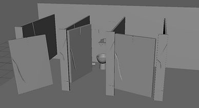
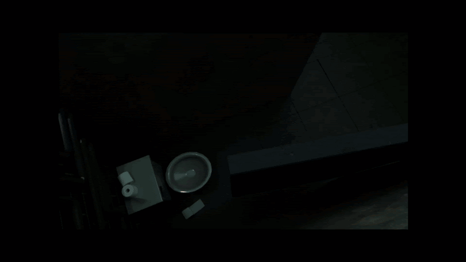
While modelling, the bathroom ended up changing quite dramatically. Initially, I focused on creating a stylised bathroom, but I noticed a design mismatch in my objects as I went further into the design. I went back and changed some object designs to be less stylised. This is seen in the doors later on. the fluorescent lights in the hallway were also corrupted at some point, so this design changed part way through. The most difficult part of modelling was doing the tiles, as, for some reason, copying and pasting in Maya works differently from what I expected. I had to go through and delete hundreds of tiles, as they had duplicated multiple times on top of themselves. I kept the design I nthe bathroom quite simple in most places, but there were lots of elements, as all the tiles were individual objects that had to be modelled. The toilet and the sink, as I found out in Blender, were, in fact, the most difficult objects to sculpt, as they needed sharp edges but also smooth. As I was planning to animate in this environment, I needed to keep this in mind with ever decision I made with modelling.
UV Unwrapping
I followed YouTube tutorials to learn about UV unwrapping. Although it was still challenging, it was actually much easier than I had originally assumed.
To UV Unwrap, I did the following:
-
Freeze and delete any history on the object in Maya. This will prevent transformations from being applied to the UVs as I try to unwrap them.
-
Open the UV editor and press CTRL+1 to isolate a selected model.
-
Imagine any joining points on the object, and mark these seams.
-
Sometimes, UVs can become distorted because of shapes or topology; the only way to fix this (apart from having good topology) is to add more UV seams. This is dependent on the object and may require some experimenting

BEFORE
AFTER


A few before and after screenshots of some of the more complex objects I had to UV Unwrap. It was quite satisfying to know that I had put off learning this for so long, and now I can do it quickly and successfully. Unwrapping my objects also makes it a lot easier if there are custom textures I need to apply. I can now change the UV properly to make texture painting easier.
Texturing
I experimented with a lot of texturing, and it took up a lot of time. My initial plan was to follow toon shaders and paint my own textures. I ended up scrapping this plan, as I felt with the lighting I wanted the textures would look underwhelming.


These were my initial tests using toon shaders in Maya. Although I like the look of some of the tests, particularly the dark green ones, I felt like once lighting had been added to the scene, it would be overwhelming with colour and appear too flat. I went on to experiment with image textures. I did keep toon shaders in certain parts of the model, but I felt that for the context of the environment, it needed some texture.


While I was texturing, I tried to keep the lighting slightly coloured, as I knew this was what I wanted from the final image. I realised that some of the textures looked dramatically different under different lighting. Doing this ensured that I had chosen and altered textures correctly so they looked nicer in my final renders.
Lighting
As I mentioned at the start, something I've always struggled with has been lighting, even though it's one of my favourite parts of modelling. Before beginning, I watched through some tutorials about lighting scenes, to try and break dow where I have been going wrong previously.


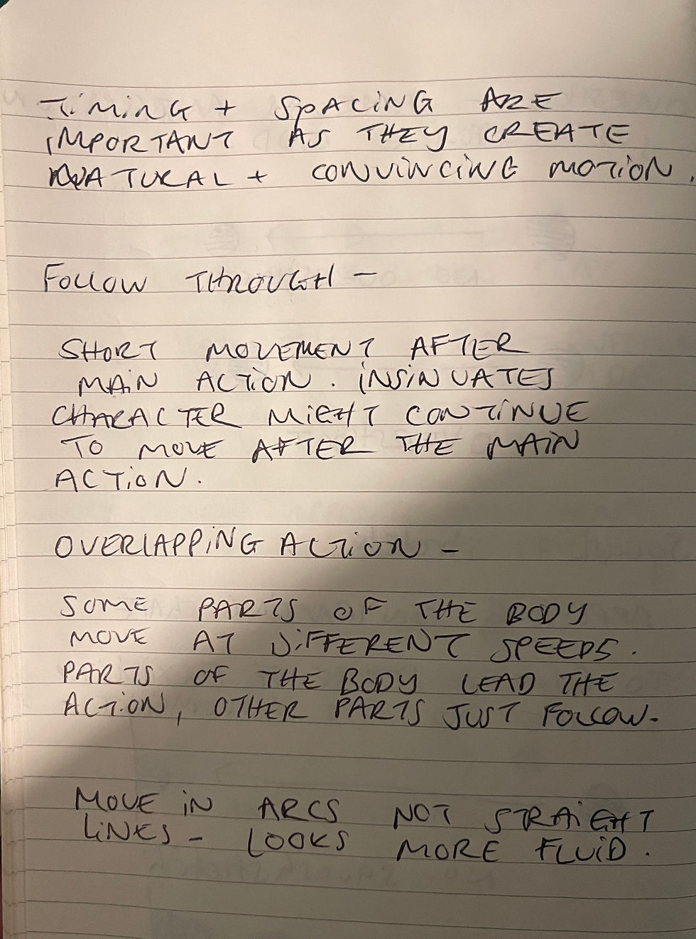
In most films, either animated or live action, they make use of three point lighting to successfully frame shots.
The key light is the primary light source, often setting the scene's initial mood. A harsh key light can cast hard shadows, perfect for creating a mood of suspense or drama. Conversely, a softer key light can produce a gentle and inviting atmosphere.
The fill light works with the key light, mitigating shadow intensity and affecting the scene’s emotional tone. A dim fill light adds mystery and depth, while a brighter one can create a more open and honest space.
The backlight adds depth and separation, critical in scenes conveying isolation or highlighting a character’s prominence. It outlines the subject, detaching it from the background, a technique used to focus the viewer’s attention.
Using what I had learnt, I went through a few scenes from Trainspotting and tried to apply what I had learnt to the shots. This helped me figure out where the lighting was positioned in scenes. Currently, this is a bit difficult for me to figure out in my own scene as there was no character. I knew where the lights should go, but there was no character to be highlighted within these scenes. So I had to alter this knowledge slightly and focus on a point within the scene to highlight, imitating the 'character' as the main focus point.
My main goal was to make the bathroom look well-lit while also creating depth and ambience.
.png)
To take my research further, I experimented with tutorials to understand how different angles can affect lighting a character (or transferrable to a scene)
Setting up Cameras and Lighting
Something I had yet to consider was how much trouble I'd have to set up all the prep for rendering. As the scene was enclosed. I was limited on space for cameras and lighting. This also meant all of the lighting within the scene was artificial. This has been my biggest downfall in previous projects. So this accentuated my need to get this right.


As there were so many shots, many cameras and lights were all close to each other. This definitely made it confusing. Using the knowledge I had learnt previously, I was attentive to make sure the lights were all in the correct places, and that unless on purpose, no area was covered in darkness.
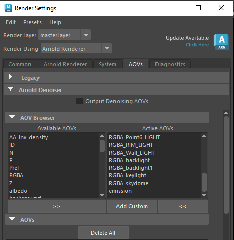
Light AOV's
To composite the final shots properly I needed to render separate passes for all of the lighting in the scene. Doing this meant that colour grading and correction would be a lot easier as I had access to all of the different light sources in my scene. This was a lot of back and forth trying to figure out how to render it properly


Making the light AOV's mainly was sorting out the render setting for the scenes. In my lights (which I had made groups for to be organised) I needed to go and assign them a name in the AOV light group. Otherwise they would just render in the default beauty pass. Once they had a name, I needed to add them to the AOV render passes. This was just adding them under the name 'RGB_lightsource'.
Once I had done this, I could render the image, and it would create all of the render passes. The first was the beauty, which was all of the lighting together in one image. The others would just be the isolated lighting sources. This meant that when I saved the beauty pass as an .EXR file. Taking it into nuke I could separate all of the render passes to be able to edit them individually.
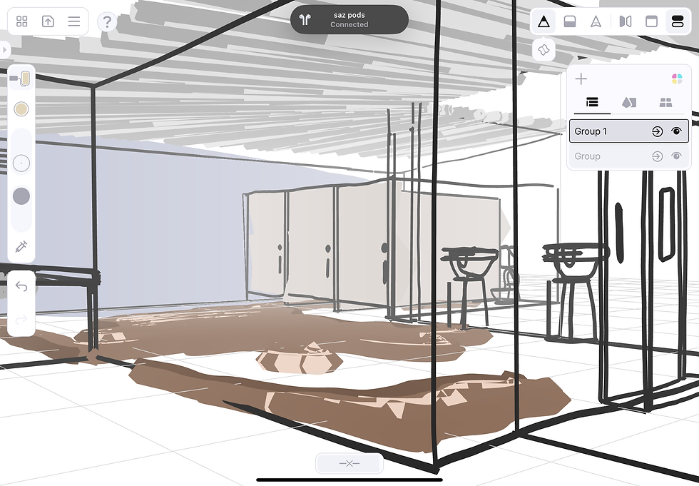
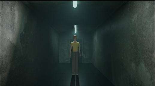
Final Maya Rendered Shots
I added atmospheric fog to the scene after changing the light AOV's. I realised that the fog accentuated the lighting quite a bit, and added extra emission to the lighting. Specifically in the 4th shot, I feel like this added a lot more depth to the render. With the first shot in the bathroom, I struggled to balance the lighting and fog, I ended up turning the fog down slightly ,otherwise the bathroom looked very cloudy, which wasn't the affect I was going for.


Alternative Shots

Project 2 - Toon Boom Rigging
Originally, my second project was going to be a 2D animation or animatic storyboarding. while starting this portion of the project, I realised it was a lot of work that I wasn't actually having fun with, or learning much. I have done animatic storyboarding before, and although I enjoyed it, I didn't want to spend the second portion of this project focusing on something I didn't see myself doing in the future. For that reason, I chose to move ToonBoom as it is a program I have heard a lot about and have never had time to experiment with. I started by attempting 2D Animation in ToonBoom, which I found fun, but it was a lot of rigorous work that I didnt feel was benefiting me much.
For this reason, I decided to learn 2D character rigging. This is a topic I've not been close to touching before, and the thought of learning a completely new skill in a different profession really interested me.


After much searching, I found Fabio Gioffre. Watching a portion of the first video in this series, I found that he actually explained 2D rigging in a lot of depth. This explanations and tutorials were actually teaching me unlike many tutorials which tend to be a walkthrough. Following this series, and troubleshooting in other videos and online I managed to create my character.
Character Design
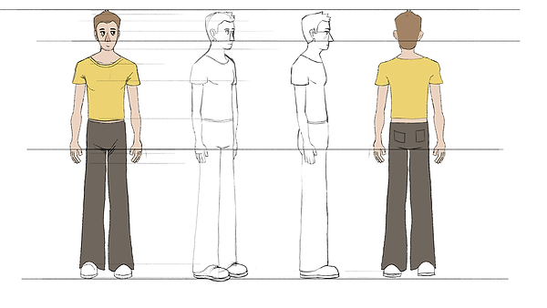
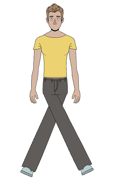
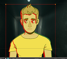
I knew that in order to create a 2D Character Rig I would have to have reference sheets for drawing and animating. That required a character design. One of the biggest struggles I had with this portion of the project was redesigning a character in a animation friendly style.
.png)


.png)

Character Sheets

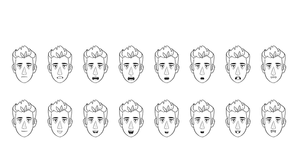

Both the hand sheet and the mouth sheet was found online. Using these as reference I made custom character sheets for my character to m0del from.
The turnaround sheet turned out to be the most time consuming part, and I wasn't happy with the 3/4 side profile. The character design varied and I compared to the other turnarounds it wasn't the same or successful. While modelling, I ended up just using this photo as reference rather than a copy. I ended up doing that for the majority of the character design really, as I was adding new details or seeing mistakes as I was modelling. The 3/4 angle did cause problems in the modelling process as I could no longer use it as a solid reference, So I ended up stemming away from my character sheet and modelling just using common sense.
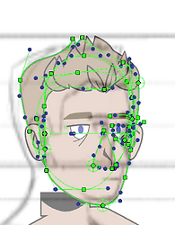
Beginning the Face


Although my rig was node-based and looked incredibly confusing at some points, It was actually relatively easy to do. The main focus was making sure each element was a separate drawing. And then makingsure all of these elements were correctly linked together. Each drawing needed to have a peg attached (the green node) and this was to ensure any time I animated or moved the drawings, this movement was linked to the peg not the drawing, otherwise this would be a permanent adjustment to the original drawing. Starting with the eyes, I just used vector lines and the paint tool to draw these. I added reformers for animation and I had some difficulty with this because of the detail in the eyes. See middle image for the wrong deformation, and my fix for this on the bottom. I added a new colour for the pupil, so I could see it properly, and also this was to make sure that ToonBooom recognised that the pupil was different to the line art.


Using cutters and overlay layers, I made eyelids for the character. The cutters meant that the eyelids was stay inside the eyes, while the overlay meant that it would stay in front of the pupils but behind the eyeliner. I also used the overlay to make a handle to activate the eyelids, as there were so many elements of the face, and the eyelids were behind the the actual face colour. doing this meant that the green squares were visible in the viewport, but not in the render, and it made working with the character easier.
For the eyebrows I followed a similar process, but using a new colour I added a block on top of the eyebrow, so that when they were lowered, the eye wouldn't show on top of the eyebrow, if they came down far enough.


The first time I drew the nose I ended up messing up, I had the line down the middle to be the tip, but at this point I hadn't considered how it would be affected by the nose deformed. I realised later on that the line actually blew out and deformed. So I had to go back and separate this detail from the actual nose shape. This is where the pegs come in handy. As I had 2 drawing for the nose. The main shape and then the detail. But as the nose was being deformed and moved through the peg, both drawings stay together as one, while being seperate.
Modelling the character consisted of drawing and troubleshooting. I had to make sure everything was in the right order. And all elements had reformers on them. Connecting everything with pegs meant I could work through each detail. Its called 'stepping up the heirarchy'. Within the nodes/pegs. I could grab 1 eye, then 2 eyes, then the eyes and eyebrows, then the top of the face (eyebrows, eyes, and nose), then all details of the face, to the whole head, the eventually the neck. This made deforming and animating much easier as I could work my way down (and up) from larger movements to smaller movements.
Screenshot of the nose deformation that I had to fix.

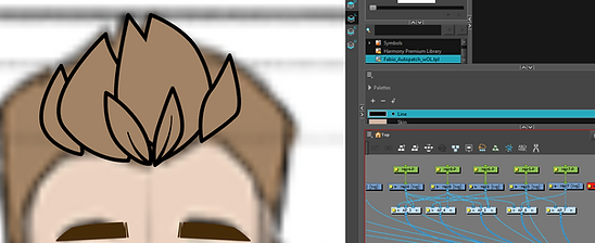


The hair ended up beign the most difficult elements to model and deform from the whole character. This is because I decided to have so many elements within the hair. Looking back now, I probably didn't have to have this many, and I could have made my life much easier. Each hair detail was individual. There were then layered from the back of the hair to the front. Using an Autopatcher (this is used to get rid of lines and merge 2 drawings together) I patched the hair together, making it appear as more like a volume of hair rather than layers of hair. This caused some problems later on when I was rotating the model, as the autopatcher continues to patch in different angles, which I wanted to change but struggled to do. I went back with overlay lines, that I had tapered, to add some detail back into the hair in spots where I thought looked appropriate.
I also made 2 sections for the back and sides of the head, which relly proved difficult later on. But I think the effort later on was worth it as there is a lot of detail in the hair.

The head so far, with the node view showing the hierarchy. At the top is the whole head, to the left in the whole hair, stemming down into the individual details. To the right is the nose , both eyes, both eyebrows, the nose and the ears. I purposefully hadn't added a mouth at this point as It was going to be an animated element.
The Mouth
To create the mouth shapes, there was only 1 drawing layer, which had drawing substitutes, these are layers held within the drawing, that can be switched between.


The mouth was quite confusing at first, so I began by following the tutorial to understand what I was doing and how it affected the mouth. The mouth was separated into 5 layers in order for it to work properly. The lip Line, the Mouth fill colour, the top teeth, bottom teeth and tongue. The mouth fill worked as a cutter for the teeth and tongue, so it needed to be separated from the lip line, otherwise the teeth would overlap the outside of the mouth. Going through each mouth pose I would move each of these elements desperately to match the reference.

Once the front mouth shapes were done, I then did the side profile. These were done without reference, as for the majority of them all it meant was moving the original profile view to the side and moving the inner mouth elements to the side slightly. Using an overlay, the side profile mouth fill was cut in half to make the mouth not look see through.

This is the first set of mouth shapes I made following the tutorial. A lot of them are off centre, not in the correct positions and they also don't follow the characters anatomy very will. Now using my own character reference sheet, I went back and reanimated all of these poses following my own reference. With the previous experience I had from this experiment it made the second time much easier and quicker to do.

This was the final version of the mouth poses for my character. They fit much better in his face and they looked a bit less exaggerated compared to the previous version of mouth shapes.

Upper Body
To create the torso I used similar techniques I used for the eyes and the hair. I drew the initial torso shape, used an autopatch to add details like pecs and depth to the torso. And used a cutter to add the collar of the shirt.
The arms took a lot of detail, as they needed to match perfectly with their pivot points, otherwise they would move weirdly. Throughout the drawing process for the arms I tried to solve the shoulder movement. I drew a bulbous shape to go into the torso, in hopes that on rotating it would imitate the shoulder moving, this didn't work 100% to plan but it did work more than I expected it to. I altered the design slightly as upon upwards movement a bulge would appear under the arms.


The upper and lower arms were auto-patched together to allow for a seamless transition, I then added overlay lines to imitate the crease that appears in the arm when flexing. I also went back into the pecs and added crease detail. These had deformers on them, so when the arm moved, I could alter the crease's length, size, or position. Duplicating the arm was relatively simple, I just had to rearrange the pivot points for the arms. As I had duplicated the peg itself, I added a node called 'static transformation' top the peg, this ensured that the mirroring of the peg for the second arm was a permanent transformation. Otherwise this would be added int other animation sequence, and on resetting the character to default position the second arm would flip back to the original position.
The Hands


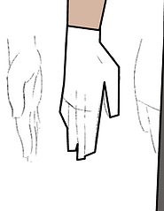

Using the references I had found earlier, I blocked out the main shapes for the hands before starting the smaller details. The hands were done as drawing substitutions I the same way as the mouth.


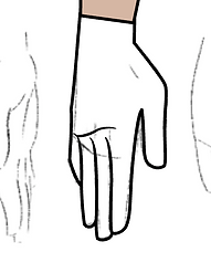

I refined the initial blocking out and added creases and colour to the drawings. I also tapered some of the inner lines to make the final hands look a bit nicer.

After modelling all of the hands, I realised that halfway through the drawing, I had accidentally scaled up the reference image, so some of the hands were huge in comparison. I had to go through each drawing substitution and scale them all down to match the rest of the hands and body proportions.

Current state of upper body with visible reformers and drawing substitutions.
The Lower Body

The legs and feet were made in the exact same way as the arms. I modelled the pelvis first, adding overlays for the crease in between the legs. I later changed this to be a separate drawing and this made it easier when rotating the character. The trouser detailed were added as drawing substitutions as I could then vary these depending on what position the pelvis was in. I decided when drawing the pelvis to add the section of torso under the shirt. Looking now, I should have added this to the shirt, as it made more sense. But it works well where it is with the pelvis.
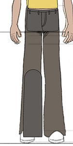

I added an autopatch to the legs as well, and added overlay lines to the edges of the legs, so when they bent it would look like they were bend. Doing this with both the arms and legs meant that if I moved the legs forwards or backwards in z-depth (bringing them in front of other objects, or behind) this would help to accentuate which way the arms were bending.

Copying the same workflow as the hands, I made various poses for the feet depending on angle and rotation. I also added an overlay for the feet if they were in front of the edge of the trousers. I also added a cutter to the edge of the trousers, as alongside the overlay, this ensured that the feet would stay underneath the trousers unless I wanted otherwise.
Once the leg was finished, this was copied in the same way, and a static-transformation was applied so the two legs would stay in place.
Working Controls


These videos show how I have successfully set the hierarchy of nodes. I can click on the hand, move up the hierarchy to animate the whole arm, and move back down to animate the lower arm. It also shows the working animations and pivot points in the arms and legs. It also shows how I can move forwards or backwards in the z-depth to move the arms and legs in front and behind each other, as well as how the cutters affect details such as the sleeve creases and they disappear on moving the arm to a certain angle.
Rotating the Model for Turnaround


To rotate the model, I made 4 new keyframes, as these would be where I modelled the new poses. I added my references to each keyframe. As I had already done the drawings, and created the reformers for each part of the body, making the new poses was just a case of moving each drawing to its desired spot. It was important that I followed the hierarchy when creating these new poses, otherwise the pivot points would not move correctly. I needed to start with whole body movements first, and work my way down to adjusting the upperbody, then the head and then smaller details. This ensured all of the pivot points stayed close to their origin.
Using the reformers, I would then alter the pegs (not the drawings!) accordingly for the pose. For the feet, as they were mirrored as drawing substitutes not pegs, I had to create a duplicate drawing substitute and flip it, otherwise the feet would just look as above. This is where the hair became difficult, as it moved in focus position, the front bits of hair would still cover the back bits due to the autopatch, So I had to vary the placement and overlays here to make sure it looked correct.
I realised while turning the character that my references were a lot more inaccurate than I thought, and I was also missing a 3/4 back reference image. I decided it would be easier to work with what I had rather than create new references, especially as my model was altered to my original profile reference. This did mean it took me longer to make the turnaround, but I think the final outcome looks better than it would have if I had followed my drawing references.
Character Turnaround

Once I had half of the character modelled, I could copy the keyframes and flip them to create the rest of the character turnaround. After flipping, I did notice some errors in the character so I went back and fixed these. They were minor changes like the shoulders raising during the turnaround or the collar not matching up.
Adding Master Controllers
For easy animation, and it being an industry standard, I decided to add master controllers for the rig. These are external controls that help with larger movements, this also helps to package the rig for animation. Currently the turnaround consists of 10 keyframes and this would not be what animators work with when animating.

Before making the master controls, I created 2 more sets to add. The first being a blinking animation. Which was a tween animation, done by ToonBoom, of the eyes opening and shutting. As well as further head tilts. I did these by copy/pasting the original turnaround into new keyframes, and deforming the head to a looking up and down position for all of the poses. I had to go back and do the head tilts a few times, as upon flipping the head tilt I realised that it either looked like he wasn't looking up, or the proportions were off. See the side image: This was a flipped head tilt where he was meant to be looking up. On flipping it looks more like his eyes are half shut rather than looking up.
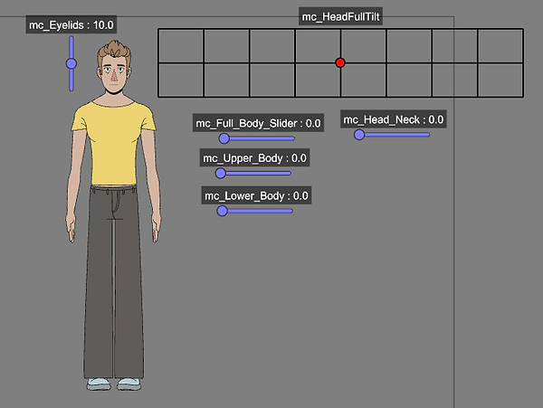

To create the controllers, I would make a master controller, and allocate keyframes to the controls. So for the full body turnaround I allocated frames 1-10. The eyeblinking had keyframes 63-90. and the headtilts needed to be allocated manually in a grid using keyframes 20-58.
With all controllers but the head, tweening can be turned off (Tweening in ToonBooms inbetweening) But the head controller isn't able to turn off tweening. This meant that there was some glitching in some frames of the head tilts that couldn't be avoided. Some tweening worked really well and others didn't, but the main poses worked perfectly.


Master Controls

These are the working main full-body controls, I realised I need to be careful not to select more than one control at once, something I didn't realise I could actually do.


This is the head controller working with the eyelid controller. It also shows the tweening glitch that happens with the controller. Some portions of the tweening work perfectly and other parts are subject to this glitch with the missing elements. The full body controller also worked to reset the rig to a default pose in the turnaround, which was helpful if each element had been moved seperately.
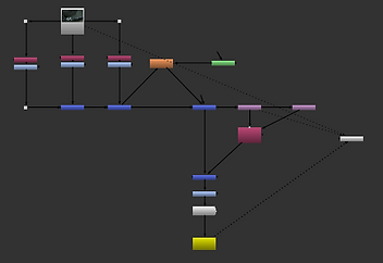
Full Node Heirachy


This is the final heirarchy of nodes for the completed flat shading character. The master rig backdrop is the first section of the rig, this contains all of the deformers, controls and drawings for the character. This is what I will use to make the importable version of the rig for animation.
Clicking into the 'Renton_Rig' group, it will open these nodes, which are the groups of the whole body, colour coded for easy access. The pink backdrop is holding the master controls for the rig. Each element is named in the backdrop to easily find and edit.
The order of the rig goes front to back, so the head is the frontmost drawing, then the neck is behind, the torso behind that, then the arms and lower body. Although this is the node setup for the rig it is possible to change by altering the Z Depth in animation. So I can bring the arm in front of the face, even if it is behind the face in the composite.

The head was grouped to lower the visible nodes In the rig. This is the group opened up to show all of the head nodes and drawings. It is also separated into individual elements.

The legs were also grouped in the rig. This is the group opened up to show all of the nodes and drawings. It is also separated into individual elements.
All the nodes are loaded into the composite in order of their appearance front to back. I have tried to order them in the same way in the viewport. The Pelvis separates the front and back leg.
Project 3 - Compositing
With both research projects 1 and 2 finished. I moved onto compositing. Originally I planned to move over to Nuke and learn some basic compositing skills in there. While experimenting, I came across a lot of troubleshooting problems regarding the ToonBoom boom import and the Maya import. Both files were compatible with each other but in order to be compatible with Nuke I needed to change the colour spaces of both the imports and this was proving to be a lot of work.


Using the knowledge from the Nuke tutorial I had followed would go well when I was colour grading and experimenting with the environment on its own. However when I would try to import the character as well this was where things would go wrong.
This is an example of me trying to import the Charcter into Nuke. ToonBoom wouldn't render out my character with an alpha channel, so importing to Nuke my character would be partially see through. I also had troubles with the colour space either affecting my environment or the character, but not both.
Trying to troubleshoot this (this not being the only problem I had) was problematic as there were very limited/no resources online about importing ToonBoom files to Nuke. The most I found was a Reddit thread of someone asking a similar question. The majority of the responses were along the line of 'Why are you trying to move to another composting software when ToonBoom is also a compositing software.'
It got me thinking about WHY I was trying to move into Nuke. I had a lot of tweaking to do still in ToonBoom and Maya, so bringing in a third software almost seemed too challenging. Learning 3 software and how to work between them all. For this, I decided to stay in ToonBoom, as I had already sorted out all of the importing issues, overall this seemed to be a smarter decision.
Lighting and Surface Shading
Before beginning to merge my 2 projects, I needed to learn how to composite the lighting and shadows within my character, otherwise it would look flat in the environment, and not interact with the environment.


While searching for tutorials about shading my character, I found a ToonBoom Harmony User Guide that explained surface shading much better than many of the tutorials I was finding. I decided to use this, as well as some tutorials about surface/normal maps to help me add shadows.
One of the biggest things I struggled with here was the colours of shadows. My model was quite dull already, so adding these colours was a bit tough as it would quite regularly appear washed out and I had to figure this out.

I used this tutorial to help with my experimenting and knowledge when playing with the light and shadow shaders
Adding Lighting and Shading

This was the first variation of shading I tried. I later merged this with the ToonBoom guide, as I could get more out of the shaders, this was a simple 1 point lighting set up, which was too basic compared to what I wanted to achieve.


In order for the shading to work properly, I needed to alter the normal map for the character. On the left is ToonBooms attempt to make the normal map for me. This needed to be edited as the shadows came out very flat and there was no definition io the lighting.
To alter the normal map, I could use cutters and colour editors to change how I wanted each section to be affected. There was an alternate way, which involved using 'Volume-Object' nodes on each part of the character rig, but when I tried to do this the normal maps wouldn't work. I never managed to figure this out, so I used the colour mapping and cutters instead.
To do this, I could vary how much I wanted each colour to be bevelled and smoothed on the normal map. For the Arms I had very high bevels, so the arms would look round, while I kept the trousers quite low as this worked better with the lack of definition In the legs. For the face I experimented with adding the nose and eyes in to create definition, but this ended up looking muddy (see bottom right)


Fixing Lighting and Shading


Testing Composite of Maya and ToonBoom

With the knowledge I had learnt over the course of the second project, I wanted to try and see how well I could merge these two projects together. I had tried unsuccessfully multiple times already, but with the lighting figured out now I wanted to try.
This is my initial node set up, with the rig, shading and my scene from Maya.

I started just adding my character in, and adding the directional light coming from above. I colour dropped the emission coming from the light, and colour dropped the darkest corner of the render, then this was tweaked slightly.
I then added a new drawing in to imitate shadows coming towards the camera. I added a directional blur node to this to attempt to soften the shadow slightly

Finally I added a second directional blur to the bottom of the legs. I used a cutter on these so they only affected the rig. I made this darker, as I felt it looked more appropriate with a harsher shadow coming from the bottom of the models feet. I also multiplied the floor shadow as well here to decrease the intensity.
I need to change the colour of the shadow, it was black at the time as it was a test. The intensity of the shadow is too strong compared to the darkest colours in the room
Compared to my other tests, I think this was 1000x more successful. I had less control over how much editing I could do to the light AOV's in the background, but I could still alter it.


This was an alternative shot I rendered as I liked the angles and what I could achieve with it. The first issue I came across was the different types of lighting. From left to right the lighting is Directional, Point, and Spot. Directional gave me the best type of lighting I was looking for, but it lit up the legs which I didn't want. Point and Spot didn't emit as much colour as I wanted, if I turned off surface shading (which uses the normal map to cast shadows) the colour would appear but it would flat shade the model from the front, not the sides. I decided to use the directional light, and I then used a cutter connected to the leg shadows, this was to try and dull the light hitting the legs. This worked somewhat but it wasn't as dark as I wanted

With the bathroom lighting, I drew over the bulbs, and added a glow node, this was to increase the emission coming from the bulbs. This worked really well as it used the colour underneath to emit the glow, further accentuating the brightness of the bulbs. This is an issue I struggled to solve in Maya, while having relatively simple light model. So I added point lights to the front of the bulb, but this didn't do as much as the glow node did in ToonBoom.


Composite right now includes the addition of shadows on the floor, lighting and shadowing on the model, additional emission in the lighting.
I need to experiment further with the shading on the model, as parts of his face look quite muddy right now, and that's not the outcome I'm looking for.
Storyboarding/Animatics
Starting this project I was really ambitious about creating a full animatic/animation as one of my projects. I continued to develop more detailed storyboards for at least half of the project. I got to a certain point where I realised that time was running out to achieve what I wished for.

This was the final animatic I made. I had used .EXR files in ToonBoom to animate, but I hadn't yet realised I needed to change the ToonBoom colourspace to get the full colour values from my shots, so they appeared very dark.
Rigged Animation Tutorials
This section is sort of in the wrong place, but I didn't want to mess up the order of my animation walkthrough. I realised I needed to research rigged animation a bit more after the first set of experiments I did in shot 1. (below). I found another animation series that explained rigging a 2D character in ToonBoom, but it also went though the animation process, and key animation basics.

I started the tutorial at the animation and compositing section which included the videos:
'ANIMATION BASICS | Toon Boom Harmony Animation Tutorial | Part 17
WALK CYCLE TUTORIAL | 2D Animation | TBH
Scene SETUP, LIBRARY and TEMPLATES | Toon Boom Harmony Tutorial | Part 21
How to ANIMATE in TOON BOOM HARMONY | Tutorial | Part 1
How to ANIMATE in TOON BOOM HARMONY | Tutorial | Part 2
How to ANIMATE in TOON BOOM HARMONY | Tutorial | Part 3
Using these videos, I did a quick test, following along with one of the starter tutorials. It was doing a character turn with fluid motion.


These were my 2 key poses, both 3/4 view from my character turnaround. To start I needed to make a key anticipation pose. I took some notes from the video so I could remember some basics, I will include them here.


This was an easrly test, where I had put the main keyframes in but not edited them much. It was really quite blocky and stiff.


This was the first anticipation pose, this was then copied and flipped to the other side.
This was the final version I did for this tutorial. I didn't use my front view from my turnaround because I tried to keep as true to the tutorial as I could, and the motion seemed quicker without adding it. This movement was much more fluid.
After I'd done this experimentation, I went straight onto animating shot 2. This included more front view and motion, it seemed easier to start with this one, than any other. As the other shots included the full body, while shot 1 was the back of the body, and this seemed difficult to imply motion when there was a lack of detail to imply it with. After doing Shot 2, I went back and continued in shot 1.
With this in mind the first half of the 'Animation -Shot 1' , was commented on before I had done these experiments.
Animation- Shot 1
This was the first test I did with animation. At this point I had done no research into rigged animation in ToonBoom, and I have no prior knowledge of how rigged animation worked. I wanted to test how well the lighting reacted to the moving character. I also wanted to test how well I could integrate the character int other environment, as I was unsure about how to move the character in front of and behind objects in a 2D space.

My first goal was to successfully get the character moving I the environment, with the main lighting set up. You can see a few issues here with the tweeting, where objects in the Z-depth move forward as the tweeting happens. So this was my second priority to sort out.

I had successfully sorted out the tweening issue. I was unsure how to create a movement that imitated walking so I added a light bounce to the character. I also added a cutter to the visible wall, that activated around halfway through, so that when the character moved back that way he would get cut off by the wall. This imitated him walking around the corner.
I fully realised here that this was a type of animation I wasn't used to, and it wasnt a topic I was going to be able to transfer all my 2D animation knowledge to easily. So I did some research about animating 2d character rigs.

I revisited this shot after watching through some tutorials. I wasn't too worried about details in this one, just the timing being correct. This scene was the first one and it is very quick. I need to go bac kand make note of my lighting shaders as currently shot 1 and 2 have different lighting.

I changed the lighting to match shot 2. I had to move around the light positioning as it reduced the highlight quite a lot.
Shot 2

I set up rough keyframes and the background, as well as adding some of the lighting elements so it looked a bit better. I made note at this point that during compositing I wanted to look into camera shakes, as I relly liked the rough feel of the keyframes, but the background felt very static in comparison.

I added some slight variation into his head movements and upper body to add some more life into the walk.

I started adding the inbetween poses here. I wasn't happy with the final frame and how far over the body was, I knew the camera cut around that frame so I left it for the minute as I was optimistic that with the next scene it would look fine.
I needed to slow down the frames though, as although this scene was meant to be quick this just felt robotic.

I was happy with the timing of the shot now. However I wanted to go back and work further on the arms in the first few frames. I had played around with them already, but they didn't look right. For someone urgently moving through h a corridor they didn't exactly have much motion to them.

I added the cutter in for the wall, and I was really happy with this. I wanted to work further on the first few shots as it sort of looked like he was sliding across the floor not walking.

It wasnt a drastic change but I think it worked really well.
That concludes all of the animation for shot 2
The background was animated on alternating frames from the character. This separated them both a bit more and I feel like it makes the camera movement look a lot more dynamic.
The character is animated on equal frames and the background is animated on odd frames.
Shot 3
Shot 3 was a simple zoom in, but I wanted to add something else to it to make it insteresting.

I started out with just setting up the zoom how I wanted. and changing the zoom from tweeting to animated on 2's.
I had originally tried to keep backgrounds on tweeting, but with the characters and the already 3D background, it just looked odd.
Shot 4
Shot 4 was the most difficult scene in the Hallway, it was shot from a down angle, and even though I had headtilts to help wit the animation here, getting it to look correct was tough.

Same as the rest of the shots so far, I set out the background animation first, this was still on a tween right now as I didn't want extra keyframes taking up space, while I was trying to figure this out.
I blocked out the rough motion I wanted to have, but I was struggling with the angles. I didn't have enough extremity In the model to emulate a low camera angle.

I adjusted the timing and added a few in between. The movement seemed too harsh so I want to try and calm down the walking to look less jittery. I also want to move him slightly away from the camera at the first few frames. I like him at the top of the shot but it needs to be further away at the start I think.
I also want to add some more head movement as it looks a bit boring right now.

I didnt fix the jitter issue in this test, I thought I would have solved the further away issue with the first few frames, but I think it just pointed out that he needs to move closer in centre with the camera not moving up.

I solved the biggest issues with the jittering and the camera angles. I did this by using the onion frames and just moving the worst of the jitters closer to the rest of the frames.

I decided to play around with head movement a bit more using my head master controller. I forgot that when I use the master controller it overrides any animation I had already done, si U needed to redo the face animation.

I added some of the face details back in, I need to go again and do the eyes and eyebrows. There are also a few tweaks in the hair which are jittering so I need to sort these out. You can also see one of the issues with the head transformer/turnaround here. Because it is done with flipped transformations the hair is also flipped in a few frames.
Quickly editing frames 1-4 together, I also noticed that shot 4 moves slower than the other frames, this isn't inheritly a bad thing but I do need to keep an eye on it just incase.

I wasnt sure how I felt about this shot as a lone shot. I think the fade needed to be more drastic with the character getting closer to the camera.
I needed to see it together wit the next shot to have a correct judgement 0n how it looked.
Shot 5
Shot 5 was postponed for the time being. It required animation within Maya, and the render time is currently too high. I left it and went onto later shots hoping to come back to it.
Shot 6
I knew I was going to have to do research in advance of shot 6. Not only was it a fast-moving walk cycle, but it was moving towards the camera as well. This meant there would be a lot of deformation on the character, but also a lot of perspective.

I started blocking out as much as I could, but for some reason my deformations were moving across keyframes which they shouldn't have. So from the first frame my character was deformed, which didn't make it easy to use my master controls or deformers.
Another part of this shot that was going to be difficult was the shadows. This was a moving shadow that deformed with the character and the floor. I had no clue how to approach this.

I managed to get most of the contact poses down with only a few problems. I realised at this point that the lighting needed to be animated as well because I was using the point light this time.
The spacing between the first and second frame seemed too far apart as well so I needed to sort that out.
Looking at the lighting as well, the back shot seemed too dark compared to the lighting in the scene, this was an easy fix though, as this could be animated in with the light movement as well.

Kept going with inbetweening
Lighting was putting me off at this point, both in the Maya scene and on the character but I ignored it for the time being as I needed to focus on animation.
First frame was too slow but too quick kat the same time, think I need some more movement before he moves off.


I was pretty happy with the animation at this point. It wasn't perfect but I had learnt a lot and it was better than I expected. All I needed to do now was sort out the shading, figure out how to reduce the intensity on the spot light. And add the shadows

This was my first test with the shadow. The animation was linked to the character peg but I had to do the transforms on the shadow for the correct perspective. This was difficult wit the light position.

I liked the positioning of the shadow at the start and end here, however the transition from the wall to the floor felt really unnatural.
I also edited the lighting here so it wasn't as harsh.

I slowed down the last couple of frames as I felt like the shot was moving too fast.
Background Compositing


Animation So Far
Compilation of Scrapped/Failed Ideas
This section is going to consist of tests ideas I started to work through before settling on my final 3 projects. I had many ideas at the start of this research project, and I think its worth mentioning them, as they are all part of the journey to how I progressed. Everything in this section helped me in some way reach the end goal for this project, but I don't c0nsider it to be structured or relevant enough to be in the final Walkthrough of this unit. So it can be found here.
Initial Ideas
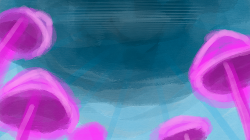
Beginning this project, I was originally thinking about creating something with the final outcome being similar to my concept art inspirations at the start. I didn't really develop much from these concept art inspirations within my final project. But these experiments looked into this a bit more. Originally, before the TrainSpotting bathroom was finalised, I planned to do something similar to SpiderVerse. Using a dreamwave inspired/ oversaturated illustrative look. I realised very early on that although I loved the look (The neon bathroom in my concept art section was one of my favourites) I had absolutely no clue how I was going to execute it as one of my projects. It seemed like something that was too big to be just 1 project, but not enough to be 3. So I moved on from that idea.
.png)
.png)
This was going to be a development from the Trainspotting plot. My plan was to take the original storyline, and completely reimagine it in this over-saturated illustrative neon style. I really loved the idea but with all of the research elements and work I would have to do I decided the timeline would not have worked. Looking back, I do think the timeline would have worked, I'm just not sure how good the outcome would have been with the amount of time and effort I would have to put in. This was a topic that required me to already have a good understanding of composition and lighting, and I'm not sure its a brief that I would have been able to successfully meet.

.png)
.png)
.png)
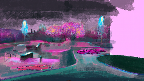
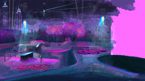
This was the first drawing I did at the start of this project brief. I used an image of a skatepark as a base layer and just continued drawing over it until it became something completely new. I was heavily inspired by painterly concept art, and I loved the idea of doing something similar to the SpiderVerse. I was pushed away from this by lecturers (rightly so) because it was a lot to achieve, and had been done multiple times previously. I attempted to take it in a new direction, with this being out of city centre, but I struggled to be inspired by something that other people were warning me about. I loved the outcome I produced, and annoyingly I think its probably the best piece of concept are I have in this project. Although this slowly developed into my current idea, from spiderverse, to bathrooms to trainspotting to my final idea, I am glad I didn't go down the SpiderVerse road, as I probably would have struggled to complete it, and just been one of the many people who have tried to recreate it.
Unfinished Artist Studies
I was inspired heavily by a lot of peers and artists at the first half of this project. I saw a lot of people doing artist studies and I thought it would be a good thing to do as well. What I failed to consider was my own perfectionism and need to do something properly. I took some stills from Entergalactica and I tried to study and recreate them in my own way. I didn't fail, but I realised that I was spending too much time on a portion of my research portfolio that wasn't even one of my final three outcomes, or was research for the outcomes. I was trying to bulk out my portfolio with impressive, detailed artist studies instead of learning and developing my own skills
.png)
.png)
I did really enjoy doing the parts of these studies, but the perfectionism in me is not capable of doing something wrong. I decided it was best to leave these and take the few inspirations I had got and move on. Otherwise I would have spent 4 weeks studying artists.
Testing Week: AutoCAD and Technical Drawing
After my surgery, I had a meeting with my lecturers about what I was going to submit, as I knew from the beginning of this project I was being ambitious, but at this point I had lost 4 weeks of time and ambitious was no longer completely possible. My plan was to spend 1 week deciding between Nuke and AutoCAD, to see which I preferred and enjoyed doing more. My thinking was, if I spent this time figuring out which one I liked more, I would be more efficient and enjoy that section more.
I used AutoCAD on my IPad and computer, as well as Procreate to try and learn as much about technical drawing as I could in that week. At the end of the week when I had my follow up meeting, and I had been looking at the wrong type of Technical Drawing. I'd been focusing on Architectural/Engineering tech drawings instead of Set Design Technical Drawing. Because of this, and the fact that I thought it was reasonably difficult anyways, I decided to not do this idea.
Below are my experiments in trying to create a floorplan of the bathroom in AutoCAD.


.png)

Testing Week: Nuke
This is a follow-up to the previous section. I felt uncomfortable putting this in my main research portfolio as this was less learning more copying. I did learn a lot from this tutorial, but I didn't complete this independently enough to consider it my own work. I found a series of tutorials on Youtube about compositing. It came with a link to the project files and assets so you could follow along. And that's what I did. There were sections I learnt from, like shuffling and separating .EXR files. Colour Grading and Colour Correction I learnt a lot about. I also remembered about some of the filters like blur and noise. These all made their way into my final outcomes Everything else is not exactly there though, as I don't think I was really learning anything, more just watching a tutorial and putting assets where the guy in the video said to. This differed a lot to the Rigging tutorial I watched, and I think I knew this when it came to learning ToonBoom, so I actively avoiding following this approach to make sure I was actually learning.


This is a selection of .GIFS showing the start-to-finish process of the compositing. Below will be a couple of screenshots of the node work I did, specifically the sections I actually learnt something from and have used in other portions of the project.


(Above)
This is where I learnt to take apart the .EXR files and separate the layers, and be able to put them back ontop of each other properly.
(Side)
This was making chromatic aberration, which appears in almost every photo taken, just very slightly. With composting chromatic aberration isn't visible because the images have been merged together or 3D modelled. So there is no chromatic aberration like real life.
Below is a screenshot of the tutorial I followed.
Keyframe Animation
I made many attempts and tests to keyframe animate in project 2. These quick tests experimented with character design and my Maya model.

This was a rotoscope animation I did, the intent behind this was to figure out how I could composite the two scenes together. The biggest issues I had with this experimentation was the model looking muddy and dull on colour correction.

This was one of the final tests I did animating in ToonBoom before moving to rigging. With what I wished to achieve I knew keyframe animation was way too ambitious and time consuming. I also didn't feel tested enough in the right way. I was struggling keeping consistent style in the model, but this wasn't something I felt that I could build from as an inspiration for my research portfolio.
The Underwater Scene
The underwater scene was meant to be my way to experiment with oversaturation and neon lights, as said at the beginning of the project. However, as deadlines drew closer, I realised I hadn't allocated enough time to successfully complete this portion. The rough drawings had made their way into the animatic, but I had begun to illustrate the scene further. Originally, I had planned to 3D model and texture the underwater scene, but I started to experiment with a 2D background here. I thought further merging the mixed animation techniques I was already using would look really cool and accentuate the story if I combined 2D and 3D environments with a 2D character. This portion was inspired by a previous project done by peers.

This was the inital blocking out stage, as I was inspired by the angle of the scene in trainspotting, but I also wanted all of these elements and the scene itself to feel humongous. I also experimented with colour during this period, as I knew I wanted it to be incredibly oversaturated, almost like it was a dream.


I knew I wanted quite loose dynamic colouring and lineart, so I tried to be inspired by my inital concept art inspiration and follow this. I got a bit too detailed with the first glow mushroom, but the lillipad vines I was really happy with and I loved the way these looked. This was where I realised how much better this scene would look illustrated rather than 3D Modelled.
Below is my inital testings with making the environment 3D, this didnt get too advanced as I was experimenting and also realised very quickly that I preferred the drawings.


The biggest decider against this 3D scene, was issues with my own computer. Originally, my second research topic was going to revolve around Substance Painter. As I was moving forward wit this for project 2, something happened to my Substance Painter license and I was no longer able to use Substance Painter on my computer at home. With Christmas coming very soon, I realised I wouldn't have enough time to focus this as one of my projects, as I wouldn't have access to the software in my free time. I do definitely prefer the illustrative style more, but using Substance Painter has been something I have been looking to do for a long time.
Grease Pencil Environment and Character Experiments
When I was experimenting with stylisation, I was initially drawn to styles imitating 2D, but were 3D. I did a variety of experiments around this concept, in both Blender and Maya. This was to figure out how easily I would be able to imitate these styles if I went though with it.
Some of these experiments can be seen above in my Maya modelling, before I moved to texturing.


Using a free model I found on BlenderKit, I started experimenting with toon shaders on a 3d model to emulate a 2D style. I found an issue with this where the toon shaders didn't respond to coloured lighting, so I had to try and debug this myself. I was successful with the help of a youtube tutorial I found where I had to use a HSV shader instead of an RGB shader. These tests worked quite well; however, I struggled with figuring out the shading on the character past very blocky shading.
After these tests, and before I had the issues with Substance Painter, I was determined to work on 3D character Creation and Rigging. Which is a big task in itself, but it was a skill I was really interested in learning. I did a couple of basic tests trying to model my own character, before I realised how difficult it was. When the problem came with Substance Painter I accepted that the 3D Model was not going to be successful without Substance. I took this as a sign that I needed to move on and focus on another topic.


I think I knew subconciously with this topic that it was a lot of work for just one research topic. So I didn't end up getting very far with it.
These experiments did push me with my modelling ability, as the only previous experience I had with detailed modelling was modelling the cat in Unit 6.


I also did further testing in Blender using my final model (this was a corrupt version, I didn't realise at the time that I had accidentally keyframed a transformation in Maya. If I had realised this sooner, I would have likely continued with the Maya - Blender transfer, but this was scrapped as I thought the Maya to Bledner transfer was a software problem not a me problem)
I really liked the outcome of this, especially as I could vary the line weight as the environment got closer to the camera. But unfortunately this idea was lost in experimentation due to my keyframe mistake.